
MJJCommunity
Staff
- Joined
- Jan 30, 2001
- Messages
- 149
- Points
- 28
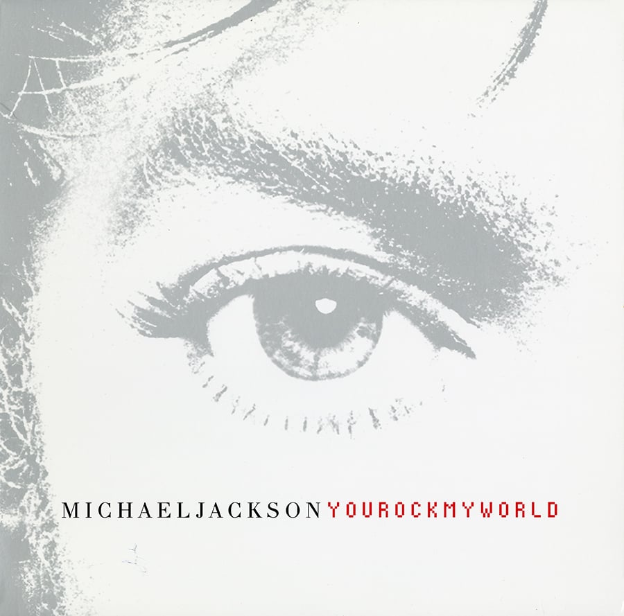
Released October 30th, 2001


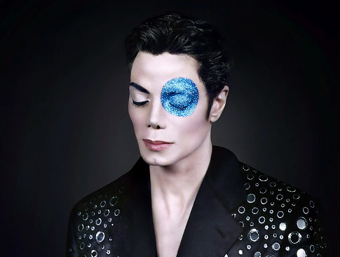
I think the picture of Michael with the blue glitter eye is absolutely breathtaking. But different strokes for different folks I suppose. :scratch:I'm so glad they went with the version they did. Those Arno Bani photos are not my cup of tea at all. And they don't show Michael in a favorable light at all, in my humble opinion. It's moments like these that make me appreciate the studio or the producer's input into the creative process. Although, I acknowledge that most of the time it's not for the best. Another example would be Quincy recommending that the Bad album stick to the standard number of tracks rather than being a 30 track double album. As ambitious as that was, it wouldn't have been nearly as successful, even if the music was good.
I think the picture of Michael with the blue glitter eye is absolutely breathtaking. But different strokes for different folks I suppose. :scratch:
Can anyone please give me the story on the invincible album cover? Ive heard so many different stories & why is his hair longer in the booklet than the cover

Those were the pictures taken by Arno Bani for the new album era impending during the recording sessions of what would become Invincible in 1999. They were supposed to be used to promote the album as a whole (album cover,promotional images,posters,billboards,etc.) They were never released until the images were auctioned off back in 2010 because Sony refused to use any of the images he took for the Invincible era because they allegedly thought that Michael didn't look right in any of the pictures used and he looked too feminine.Hmm you would think an image would surface. Hell they just released a botdf photo & only 1. you would think by now with the technology we have & everything else that leaks that it would be some where unless the story we've been told was a lie. Him painted in gold? & they released that cover. Mind blown. & where did the blue eye photo session come from & what was it for?
Wow....i never knew about this. I've always questioned those pics & how they just surfacedThose were the pictures taken by Arno Bani for the new album era impending during the recording sessions of what would become Invincible in 1999. They were supposed to be used to promote the album as a whole (album cover,promotional images,posters,billboards,etc.) They were never released until the images were auctioned off back in 2010 because Sony refused to use any of the images he took for the Invincible era because they allegedly thought that Michael didn't look right in any of the pictures used and he looked too feminine.
Wow....i never knew about this. I've always questioned those pics & how they just surfaced
Electro;4217992 said:The boy photo was obviously the inspiration, but I think to photoshop a ~1996 foto of Michael.
His face just doesn't look 1999 here. Way too full. At that time he had lost a lot weight from the exhaustng HIStory tour.
Are there any more infos on the second (colored) photo?
If that's a "back-engineered" colored version by a fan, it's very well done in some details.
Hess;4218049 said:Both Michael and Xscape covers a way better - especially the Michael cover is great.
mj_frenzy;4218067 said:They did not photoshop a 1996 photo of him.
MJ’s original photo of him painted gold was taken after the HIStory Tour (in late 90s).
Then Sony made some changes on that original photo & the final result appeared on the official ‘Invincible’ cover.
The second, colored photo is clearly a fan-made one.
The official cover of the ‘Michael’ album never appealed to me.
Also, I consider it a totally unsuccessful attempt on their part to try to recreate the magic of the ‘Dangerous’ album cover.
Can anyone please give me the story on the invincible album cover? Ive heard so many different stories & why is his hair longer in the booklet than the cover.
Originally the story begins in 1999 with Arno Bani and MJ meeting and doing the photoshoot in New York. . The cover was originally gold as Michael was painted gold for the picture (hence the little boy painted in gold; that photo was the inspiration) but Sony also refused to print the cover with the gold version (allegedly because Michael looked too feminine in the gold coloring) so instead they digitally colored the images to the five colors that ended up being released (red,green,blue,orange and silver).

:format(jpeg):mode_rgb():quality(90)/discogs-images/R-1957911-1309535873.jpeg.jpg)
:format(jpeg):mode_rgb():quality(90)/discogs-images/R-444992-1251467826.jpeg.jpg)
I think the picture of Michael with the blue glitter eye is absolutely breathtaking. But different strokes for different folks I suppose. :scratch:
T They were never released until the images were auctioned off back in 2010 because Sony refused to use any of the images he took for the Invincible era because they allegedly thought that Michael didn't look right in any of the pictures used and he looked too feminine.
Invincible cover looks cheap, MJ looks bad, the cover does not catch attention - very bad cover..
They should change the album to just the 7 real MJ songs - maybe then add 3 demos of some songs from the album.
Dangerous is by far the best cover art ever made - for any album in the world. Fits the album perfectly.


mj_frenzy;4218067 said:They did not photoshop a 1996 photo of him.
MJ’s original photo of him painted gold was taken after the HIStory Tour (in late 90s).
This Invincible album photoshoot (and the photos) for the booklet, were much, much, much better than any of that Arno Bani rubbish!!


Also, the fact that the record company released that album in the form of five different colors (in order to increase its sales) showed to me that they did not have faith in the quality of the songs on that album.
For anyone curious about the Arno Bani photos, here are some of them. I think Michael looks deathly ill....or like a china doll....soul-less. Whoever thought this was a good idea (probably Arno Bani) was freaking crazy!! These are circa 1999.

