Mister_Jay_Tee
Proud Member
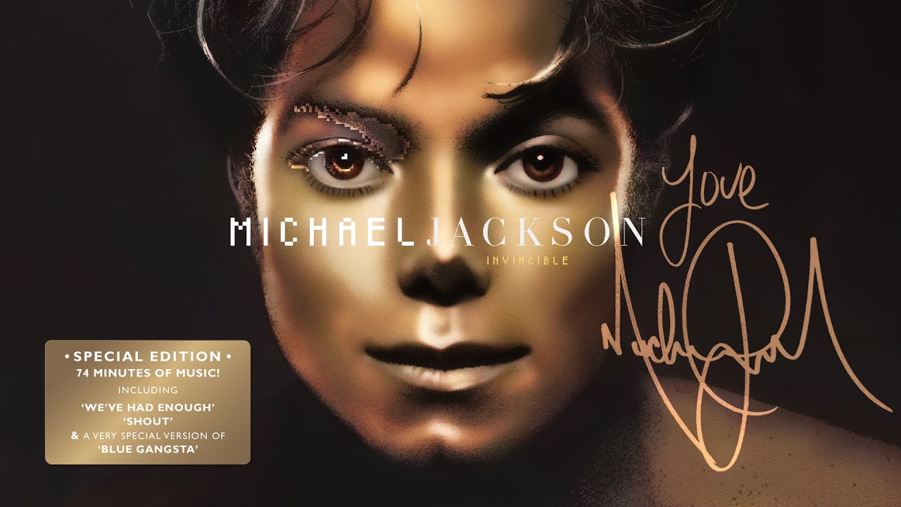
What do you think? Is it a pleasing palette? I find it personally disgusting. It remains offending.
Follow along with the video below to see how to install our site as a web app on your home screen.
Note: This feature may not be available in some browsers.
What do you think? Is it a pleasing palette? I find it personally disgusting. It remains offending.

Dude this is the most civilized Invincible thread to date and i'm all in for it lolThe fact we're at the point people can take this for serious just unnerves me.
It won't last. LolDude this is the most civilized Invincible thread to date and i'm all in for it lol
The fact we're at the point people can take this for serious just unnerves me.
 Now it is clear why I did not understand this thread. I thought something was wrong with the translation.
oh, I got the sarcasm. But I'm not genetically programmed to joke about Invincible. I love the album so I'm always in 'protective' mode, lol. Especially for the cover which I think is beautiful.The fact we're at the point people can take this for serious just unnerves me.

Mr JT has a great sense of humour - I absolutely love it - but it's also bonkers. His sarcasm is a specialist brand unavailable to almost anyone else. Keep that in mind and you won't go far wrong, lol. Plus he almost never uses emojis. He likes to test us, lol.
I need a "Sarcasm" sign or something.
I agree with everyone. I see it too. It's such a satisfying testMr JT has a great sense of humour - I absolutely love it - but it's also bonkers. His sarcasm is a specialist brand unavailable to almost anyone else. Keep that in mind and you won't go far wrong, lol. Plus he almost never uses emojis. He likes to test us, lol.

Are you also in 'protective' mode about the fact that both Michael Jackson and Sony Music in order to increase the album sales they resorted to such a cheap and contemptible method by releasing the album with different cover colours?oh, I got the sarcasm. But I'm not genetically programmed to joke about Invincible. I love the album so I'm always in 'protective' mode, lol. Especially for the cover which I think is beautiful.
It is interesting that, according to reports, Uri Geller's drawing (in the album's booklet) was originally meant as the front cover of that album.Personally I think the liner note photos were better.
I actually spent a lot of time researching the Invincible fonts. It's like its own unique font for the title, and then two different fonts for MJ's name, both halves. I used it to successfully recreate the "Speechless" promo single from Korea. And the "Taste of Invincible" Single.Gotta love the Invicible Threads. Next Invicible Thread “Did the album font affect the quality of the album?”
But to answer your question, that specific color palette never sat right with me. I don’t know why, but it always struck me as odd.
My true confession is that MJ held me at gunpoint and forced me to buy all 5 color invincible albums while raging about how Tommy Motola liked Jermaine and Prince more than him.Are you also in 'protective' mode about the fact that both Michael Jackson and Sony Music in order to increase the album sales they resorted to such a cheap and contemptible method by releasing the album with different cover colours?
One Word Title, like Thriller Bad Dangerous, not bad@Mister_Jay_Tee Paranoia
That’s neat. Can you share that?I actually spent a lot of time researching the Invincible fonts. It's like its own unique font for the title, and then two different fonts for MJ's name, both halves. I used it to successfully recreate the "Speechless" promo single from Korea. And the "Taste of Invincible" Single.
Yeah, I'm gonna add all the highest quality MJ/Jacksons artwork I have to a Drive, when I'm done with it.That’s neat. Can you share that?

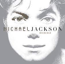
I like the top image but I struggle to see it as an album cover, aspect ratio wise mostlyI'd prefer one of these
The one they went with is so boring. I think they wanted it to look "digital" due to a lot of the music sounding "digital" as well. I also think they tried to avoid showing as much of Michael as possible because he did not look his best during those 2 years
The second and third are fan made.I'd prefer one of these
The one they went with is so boring. I think they wanted it to look "digital" due to a lot of the music sounding "digital" as well. I also think they tried to avoid showing as much of Michael as possible because he did not look his best during those 2 years
Nobody said they weren't, sillyThe second and third are fan made.
I can take them off your hands if you want. I'm thinking of building an art installation with them. That's assuming Michael forced you to buy hundreds of copies. The piece will remain untitled mostly bc I can't be bothered to think of one plus I'm a bit busy with Tina Turner thoughts atm.My true confession is that MJ held me at gunpoint and forced me to buy all 5 color invincible albums
DJ, you're really good at finding stuff like this!USER=119143]@Mister_Jay_Tee[/USER]:

No, he only made me buy 5 copies. One for each member of the family.I can take them off your hands if you want. I'm thinking of building an art installation with them. That's assuming Michael forced you to buy hundreds of copies.
Dang it! Now I'm crying in my latte.No, he only made me buy 5 copies. One for each member of the family.
True, but it could work if they used a more zoomed out photo, so it would capture what is in said photo, to get the ratio right I thinkI like the top image but I struggle to see it as an album cover, aspect ratio wise mostly
Ok. I actually see the vision now. Zoomed out with an all black frame would be kinda heat actually. Wouldn't feel like the way to succeed Invincible though. The all white motif was right to me actually.True, but it could work if they used a more zoomed out photo, so it would capture what is in said photo, to get the ratio right I think