Skywatcher
Proud Member
Hi all,
I have noticed there seem to be two different versions of the Xscape cover art in circulation. I'm not talking about the standard and deluxe images (which have different background designs and are otherwise only marginally different - i.e. in the outline of the shoulders, if I remember correctly), but a difference that exists in both the standard and deluxe art.
On the left side of the photo (i.e. the right side of Michael's head), his hair is different in each version. In the more common version his hair here is much straighter, whilst in the alternative version it is more curly and seems to have more body. Here's what I mean:
Standard


Deluxe

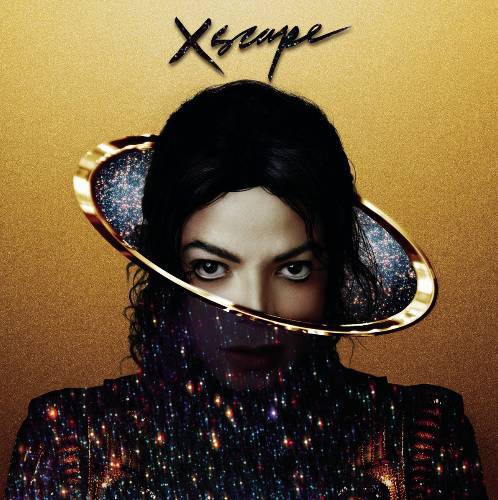
In fact, if you look closely his hair is even slightly different on the other side in each picture.
Has anyone else noticed this? Does anyone know why these differences exist?
I have noticed there seem to be two different versions of the Xscape cover art in circulation. I'm not talking about the standard and deluxe images (which have different background designs and are otherwise only marginally different - i.e. in the outline of the shoulders, if I remember correctly), but a difference that exists in both the standard and deluxe art.
On the left side of the photo (i.e. the right side of Michael's head), his hair is different in each version. In the more common version his hair here is much straighter, whilst in the alternative version it is more curly and seems to have more body. Here's what I mean:
Standard
Deluxe
In fact, if you look closely his hair is even slightly different on the other side in each picture.
Has anyone else noticed this? Does anyone know why these differences exist?
")
