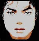
Invincible album cover

Richard76

Heartbreaker
Joined
Nov 27, 2021
Messages
1,590
Points
113
Location
Moscow
Country
Russia
Michael_Jackson_Invincible.jpeg

I
594d07f6a72d7f657c6b104762ab7591.jpg

Does anybody know, when photo from invincible album cover was taken? I thought it was somewhen from 90s. But recently i noticed that MJ hairstyle look really similiar to his Invincible era hairstyle... So could it be taken somewhen in 2000-2001?
 
It was taken during the 'Blood On The Dance Floor' era.

While both drinking water rather than alcohol, Michael Jackson discussed with photographer Albert Watson artwork ideas for his next 'Invincible' album at the Four Seasons Hotel in New York.

Albert Watson was also meant to photo shoot the singer for the 'Blood On The Dance Floor' album, but this collaboration had fallen through.

The 'Invincible' album photo cover was later heavily retouched by Sony Music (when the album was about to get a release).
 
I don’t hate the actual cover as much as some do, but the untouched pic is magnificent. This alone would’ve been a striking cover, without any text.
While the photo is gorgeous! I don't particularly like it as album cover. A cover with Michael in action, or a bit far away would have been nicer. All the other album covers are great.
 
It was taken during the 'Blood On The Dance Floor' era.

While both drinking water rather than alcohol, Michael Jackson discussed with photographer Albert Watson artwork ideas for his next 'Invincible' album at the Four Seasons Hotel in New York.

Albert Watson was also meant to photo shoot the singer for the 'Blood On The Dance Floor' album, but this collaboration had fallen through.

The 'Invincible' album photo cover was later heavily retouched by Sony Music (when the album was about to get a release).
But why then Michael have the same haircut like in invincible era? In BOTDF as far as i know, he had long hair
 
I don’t hate the actual cover as much as some do, but the untouched pic is magnificent. This alone would’ve been a striking cover, without any text.
I didn't know that some people hate the cover. Poor Invincible!

For me I can't get enough of it. I can stare at it for minutes at a time. I adore the cover, the design, the whole thing. It's my favourite of all of them. I'm not so keen on the full photo, the cropped version on the album works much better, imo. The cover design is beautiful. Wasn't keen on the different colours, it lost a lot of impact with that, I thought. But the silver cover, I get so much out of it. 🥰
Totally agree with you) final version is masterpiece
 
It was taken during the 'Blood On The Dance Floor' era.

While both drinking water rather than alcohol, Michael Jackson discussed with photographer Albert Watson artwork ideas for his next 'Invincible' album at the Four Seasons Hotel in New York.

Albert Watson was also meant to photo shoot the singer for the 'Blood On The Dance Floor' album, but this collaboration had fallen through.

The 'Invincible' album photo cover was later heavily retouched by Sony Music (when the album was about to get a release).
The picture was taken in 2001.

The original unaltered version was shared by Omer Bhatti, and posted here, a few years ago. It is the one that Michael wanted but Sony insisted it be changed.

 
This is the pic which was used and altered from Sony art department.
Sony wanted MJ to have a smile on the cover.
So they edited his lips on the corners of his mouth and turned it into a little smile.
Which is totally not MJ’s natural smile.

But his smile & upper lip in 2001/2002 is another topic.C989C5A2-5F82-453C-B963-9E0F32911ED1.jpeg
 
Last edited:
But why then Michael have the same haircut like in invincible era? In BOTDF as far as i know, he had long hair
In the photo shoot for the 'Invincible' album he also had long hair (such as, in the photos which were taken while he dances).
I didn't know that some people hate the cover. Poor Invincible!

For me I can't get enough of it. I can stare at it for minutes at a time. I adore the cover, the design, the whole thing. It's my favourite of all of them. I'm not so keen on the full photo, the cropped version on the album works much better, imo. The cover design is beautiful. Wasn't keen on the different colours, it lost a lot of impact with that, I thought. But the silver cover, I get so much out of it. 🥰
It was merely a marketing move that the album came out in different colours.

Apparently, they (the record company) hoped that the singer's fans would buy the same album in more than one colours, so that would also increase the album's sales.

This showed that they were not really confident of the songs of the album, so they had to resort to that move.

Another move that showed that they were not really confident of the songs of the album was when they forced him to sign copies of his new album for nearly two hours at the Virgin Megastore in Times Square (New York) in an effort to boost the album's sales, as well.
 
Aahh frenzy, keep it to yourself. You keep repeating yourself on and on..

This was the picture which inspired MJ’s idea for the cover:

CF58704D-1438-42C6-8655-27CD5493248A.jpeg

It’s called “Golden Boy”.
The artist is Albert Watson.
 
The picture was taken in 2001.

The original unaltered version was shared by Omer Bhatti, and posted here, a few years ago. It is the one that Michael wanted but Sony insisted it be changed.
This so-called original, unaltered version that was shared by Omer Bhatti has not been officially confirmed as the original one.

Besides, Karen Faye described the original one as "quite amazing" (that one shared by Omer Bhatti is far from quite amazing).
 
I'm not a huge fan of the official Invincible cover, it's quite anonymous to be MJ. They should have at least (!) kept the cool hairstyle included. Like the black/white in post number 3. Then, do an alternative cover with the bronze style
 
This so-called original, unaltered version that was shared by Omer Bhatti has not been officially confirmed as the original one.

Besides, Karen Faye described the original one as "quite amazing" (that one shared by Omer Bhatti is far from quite amazing).

Your logic and way of thinking is so strange. You not finding something amazing doesn't invalidate the statement she made or mean that it wasn't the photo she was talking about lol.
 
This so-called original, unaltered version that was shared by Omer Bhatti has not been officially confirmed as the original one.

Besides, Karen Faye described the original one as "quite amazing" (that one shared by Omer Bhatti is far from quite amazing).
There is no reason why it would be “officially confirmed”. I see no reason why Omer would post fake covers. They are clearly mock ups from before the album’s release, including the golden face image, which matches perfectly with Michael’s original inspiration for that picture. It also matches with how Karen Faye described it’s creation - Michael’s face being sprayed gold etc.
 
This is the pic which was used and altered from Sony art department.
Sony wanted MJ to have a smile on the cover.
So they edited his lips on the corners of his mouth and turned it into a little smile.
Which is totally not MJ’s natural smile.

But his smile & upper lip in 2001/2002 is another topic.View attachment 1873
That’s a fan made photoshop based on the silver cover. It’s not the original.
 
This is the pic which was used and altered from Sony art department.
Sony wanted MJ to have a smile on the cover.
So they edited his lips on the corners of his mouth and turned it into a little smile.
Which is totally not MJ’s natural smile.

But his smile & upper lip in 2001/2002 is another topic.View attachment 1873
Lol you know this isn't real right? Mj didn't even look like this 99-01... not at all actually. But where did you get that false information about the smile & etc? That's how rumors get started
 
The official 'Invincible' album cover is clearly a downgrade from his previous album covers.

Especially, when one compares it to the 'Dangerous' and the 'HIStory' album covers, which both look emblematic.

It was reported back then that one of the initial ideas for the 'Invincible' album cover was simply a golden, shiny jacket with diamonds on it and the words 'King of Pop' on the top of that jacket.

It would certainly have been a better choice compared to that inexpressive face that they used as the official 'Invincible' album cover.
I am sorry... But I hink that the majority of us are really tired of your opinions written as the statements without any reliable source...

I think U just should retire ;) Nobody takes u seriously here...
 
I'll be honest, I was never keen on the Invincible album cover.

Up until that point, all of Michael's album covers tell something of a story themselves and they give something of an indication of what the album is like or the direction Mike is going for. Invincible doesn't do that

I prefer the full original black and silver version, but it's still not what I think was a good choice
 
I am sorry... But I hink that the majority of us are really tired of your opinions written as the statements without any reliable source...

I think U just should retire ;) Nobody takes u seriously here...
now! now! @lubyss , let's stay respectful in our statements and no personal attacks please, even if you have a valid point.
@mj_frenzy Thanks for starting to add sources to your statements. If you don't have the source handy or it too much work to find it again, please clarify that in your statements. "its my opinion" or "i don't have the source at the moment" etc. etc.
 
Back
Top